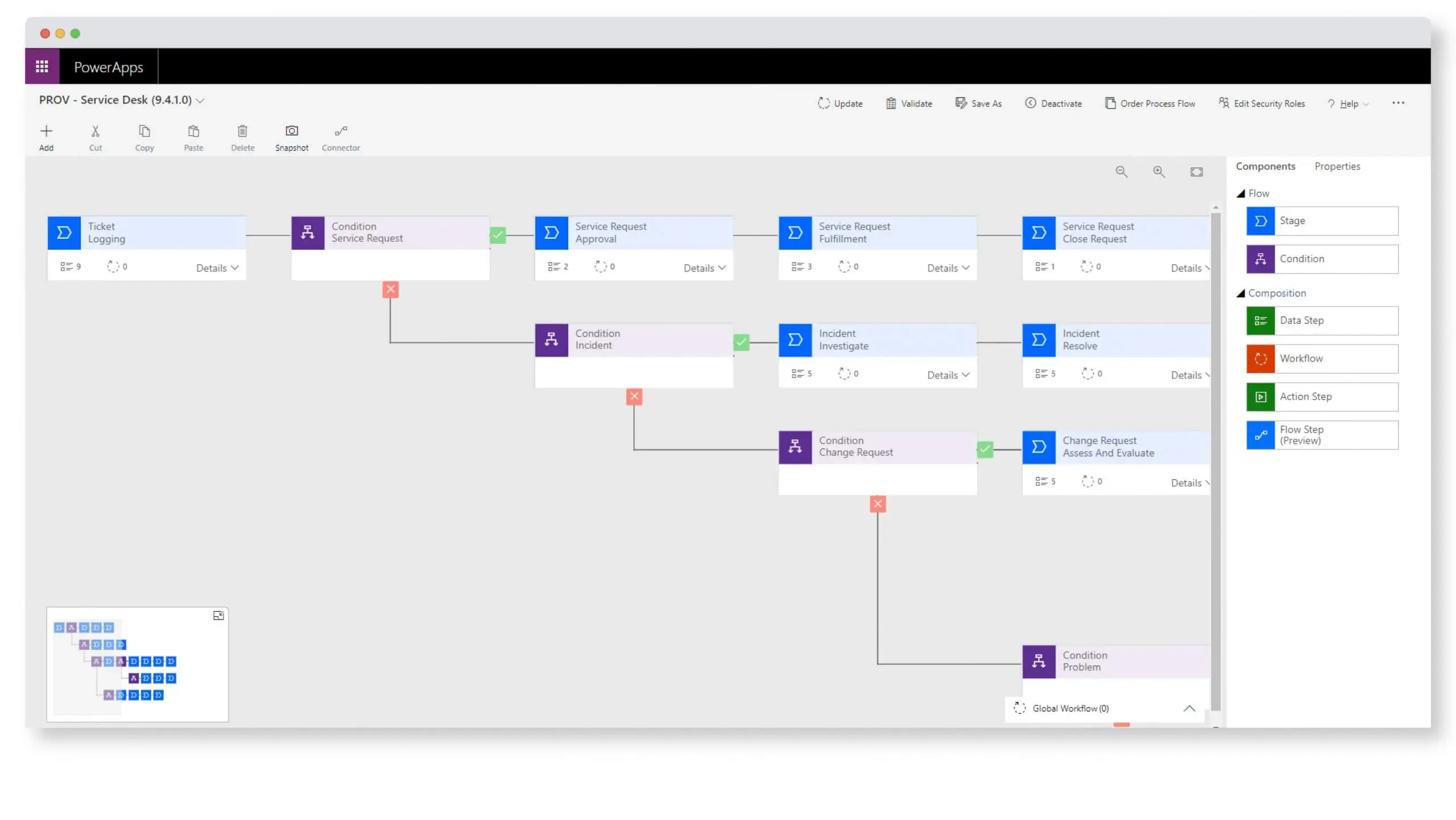
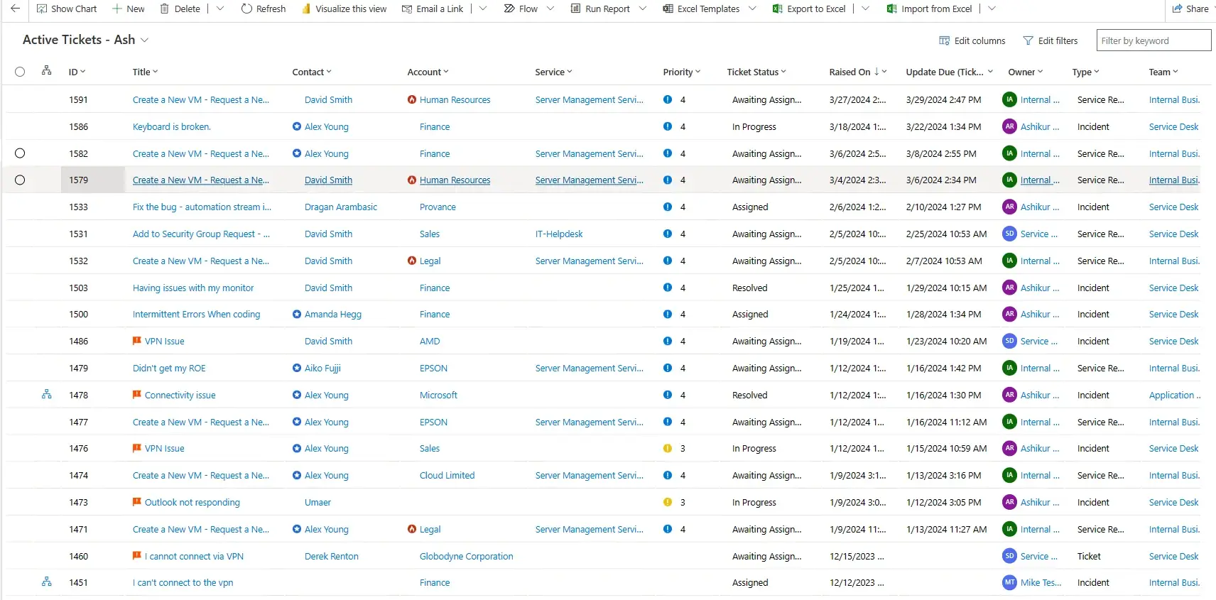
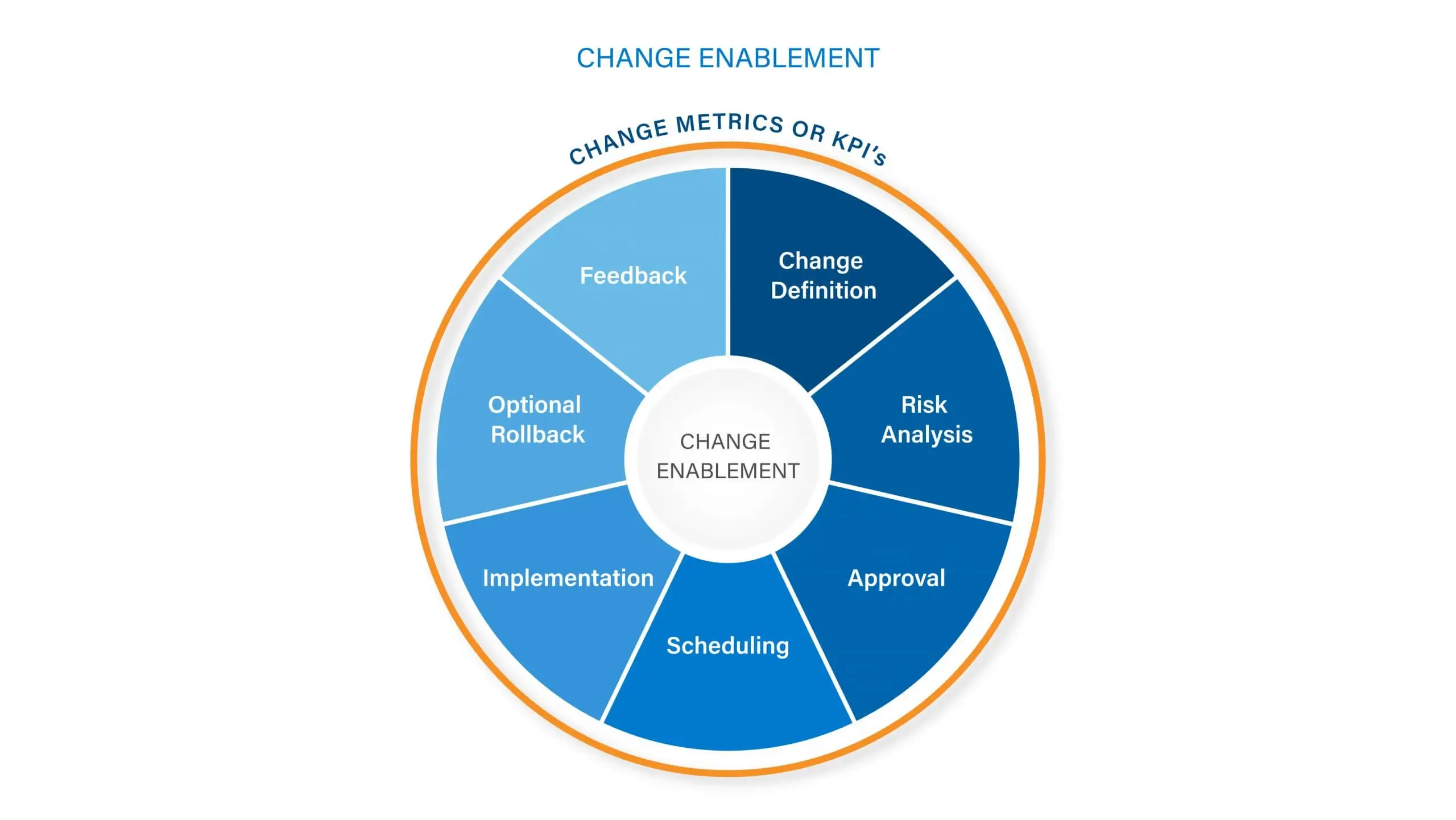
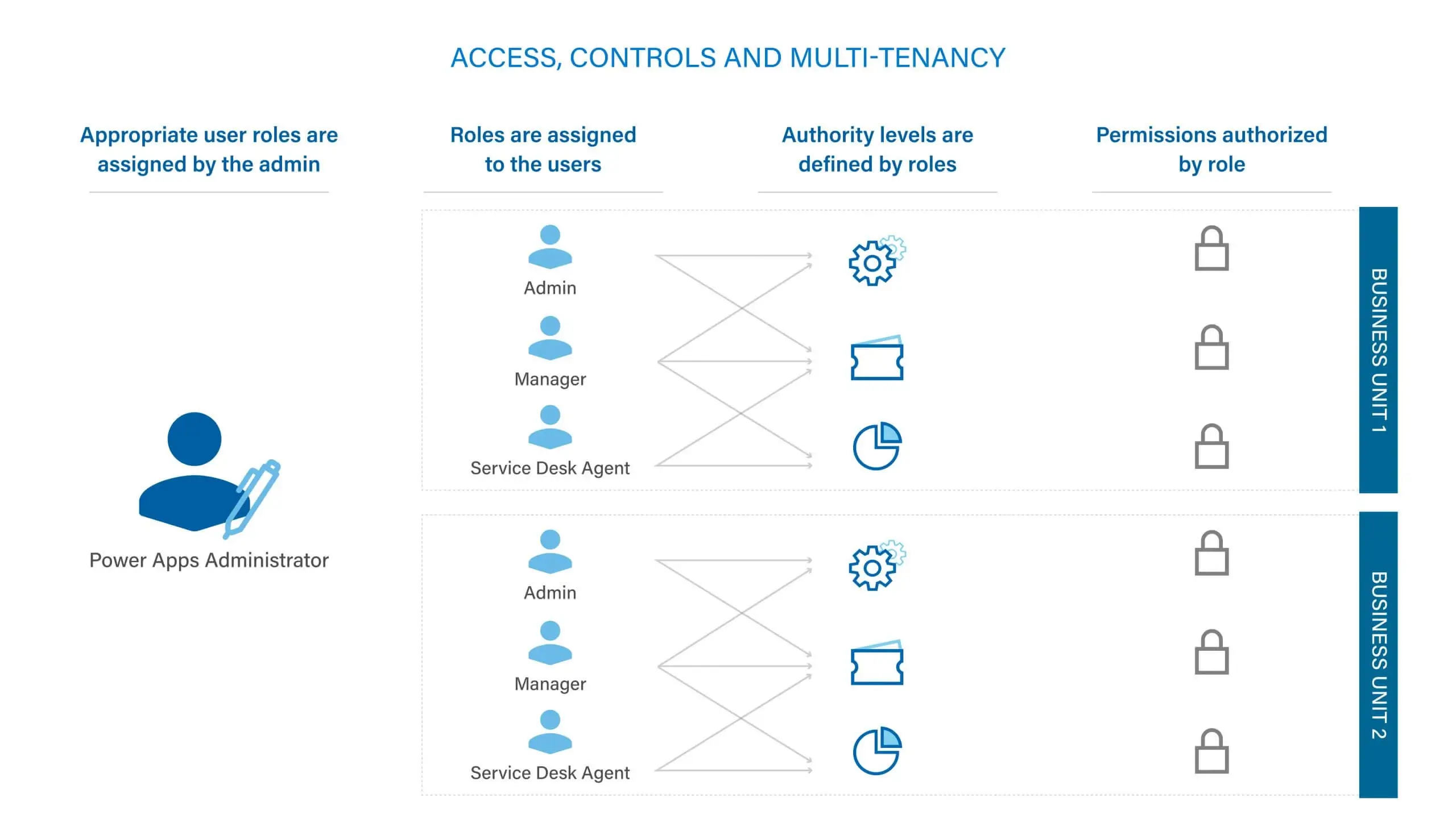
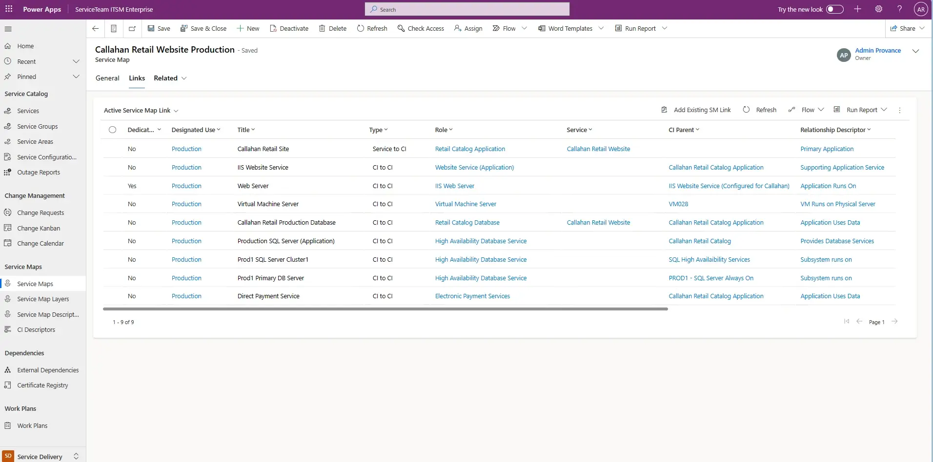
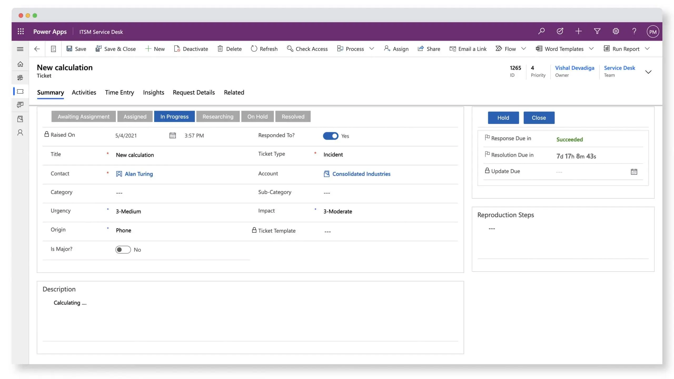
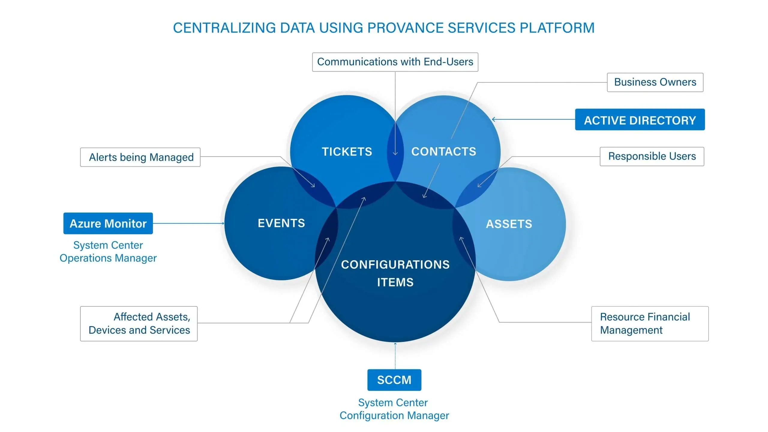
The ServiceTeam ITSM Ticket capability was engineered to focus on the agent experience. Triage incoming tickets to determine priority, urgency and issue type. ServiceTeam ITSM lets you apply standardization and automation to ticket processing—speeding up the processes of triage, assignment routing, and resolving tickets, while also ensuring that tickets opened in a freestyle format can still be aligned to a common standard—without impeding service agents’ productivity.
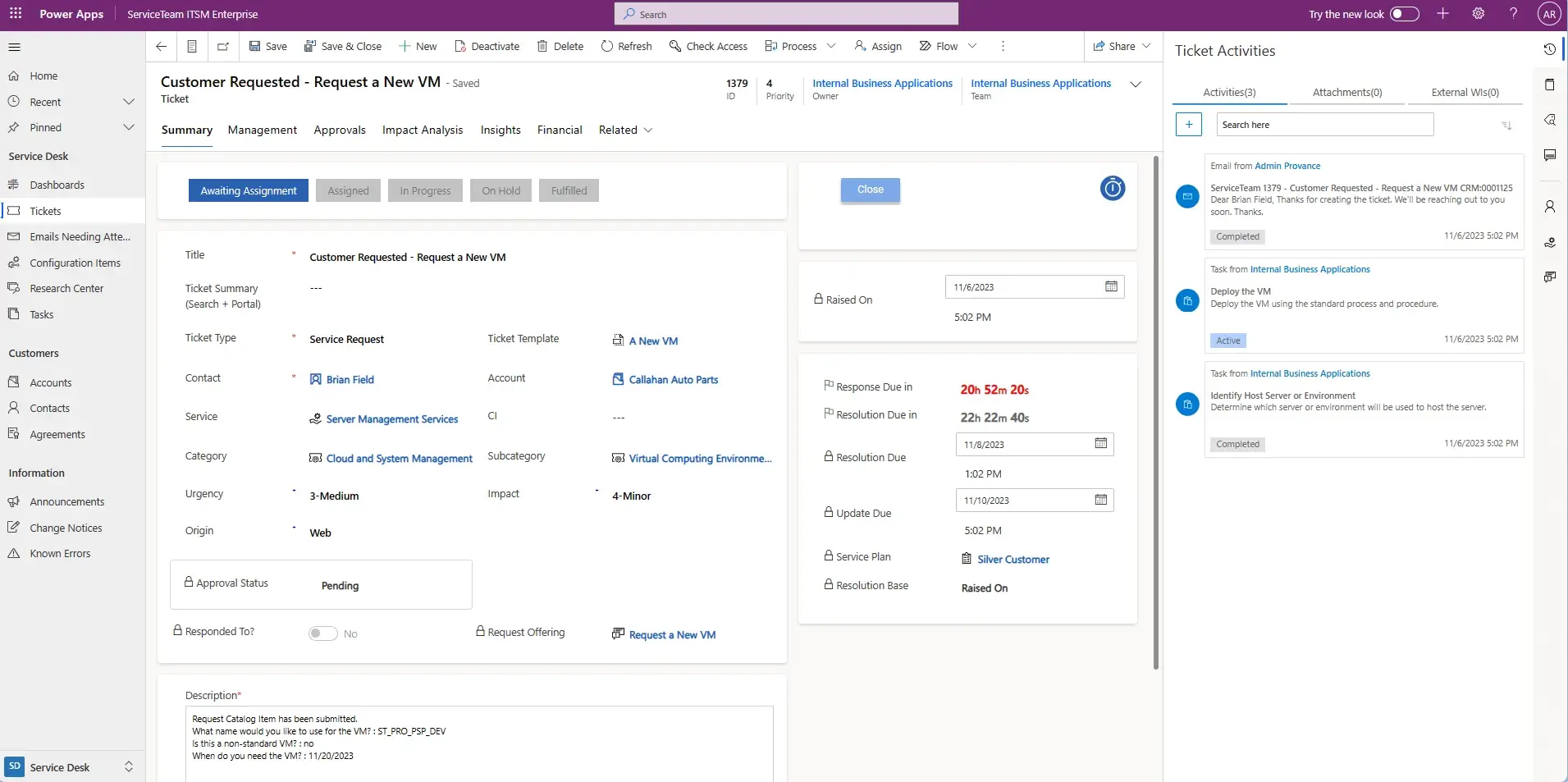
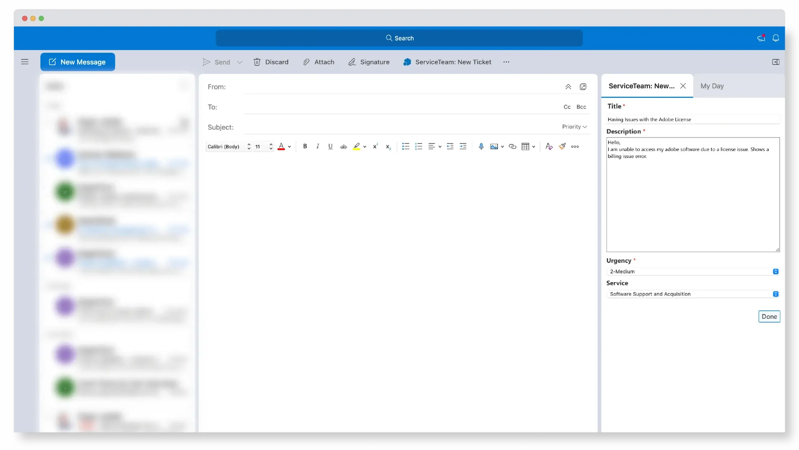
ServiceTeam ITSM infuses flexibility into the ticket resolution process, letting agent activity define ticket status. ServiceTeam ITSM lets you determine a set of ticket related questions and answers in advance to ensure accurate, reportable and timely data acquisition. Configure additional conditional questions using custom queries and sophisticated question sets to improve user experience and avoid the frustration of lengthy question sets and irrelevant questions. As part of a 360-degree view of the ticket an agent is working on, they can access all attachments from a central location, make comments, see related emails and portal comments as well as share the attachment with the user who created the ticket—eliminating the need for constant navigation between multiple locations.
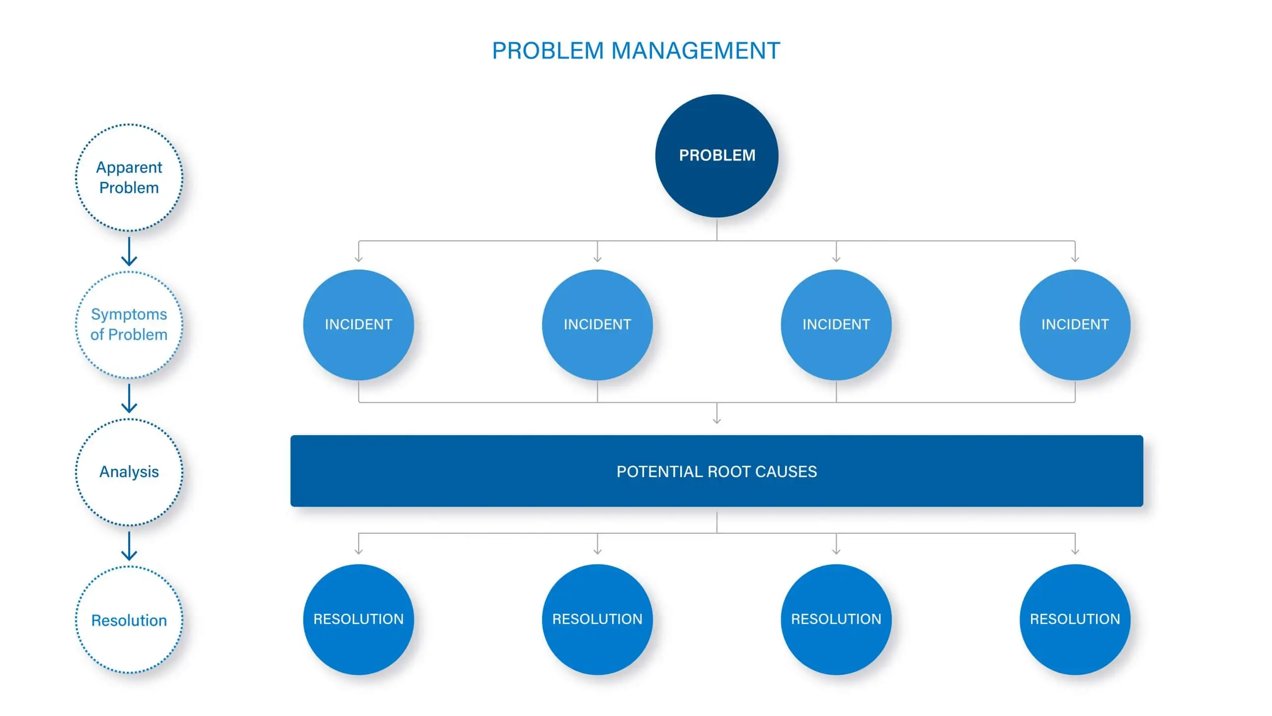
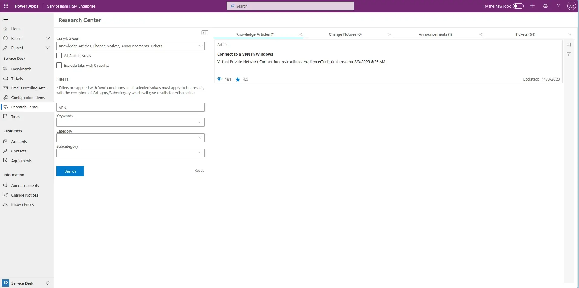
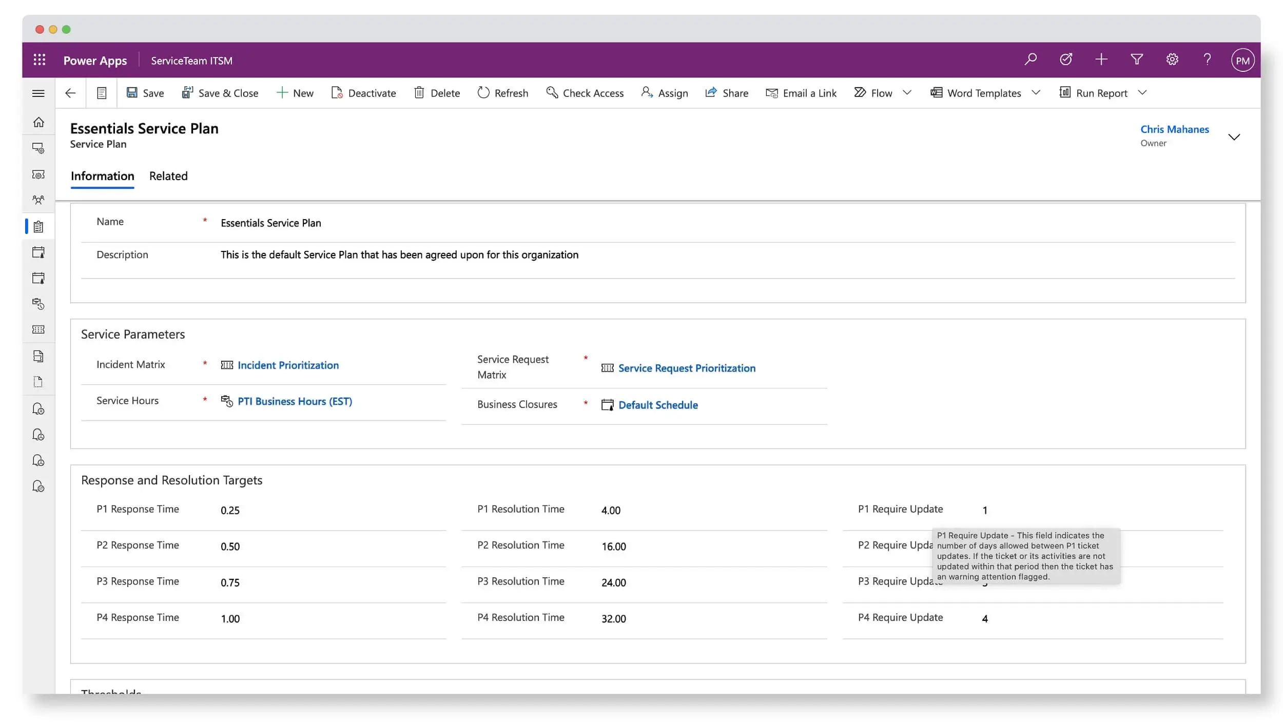
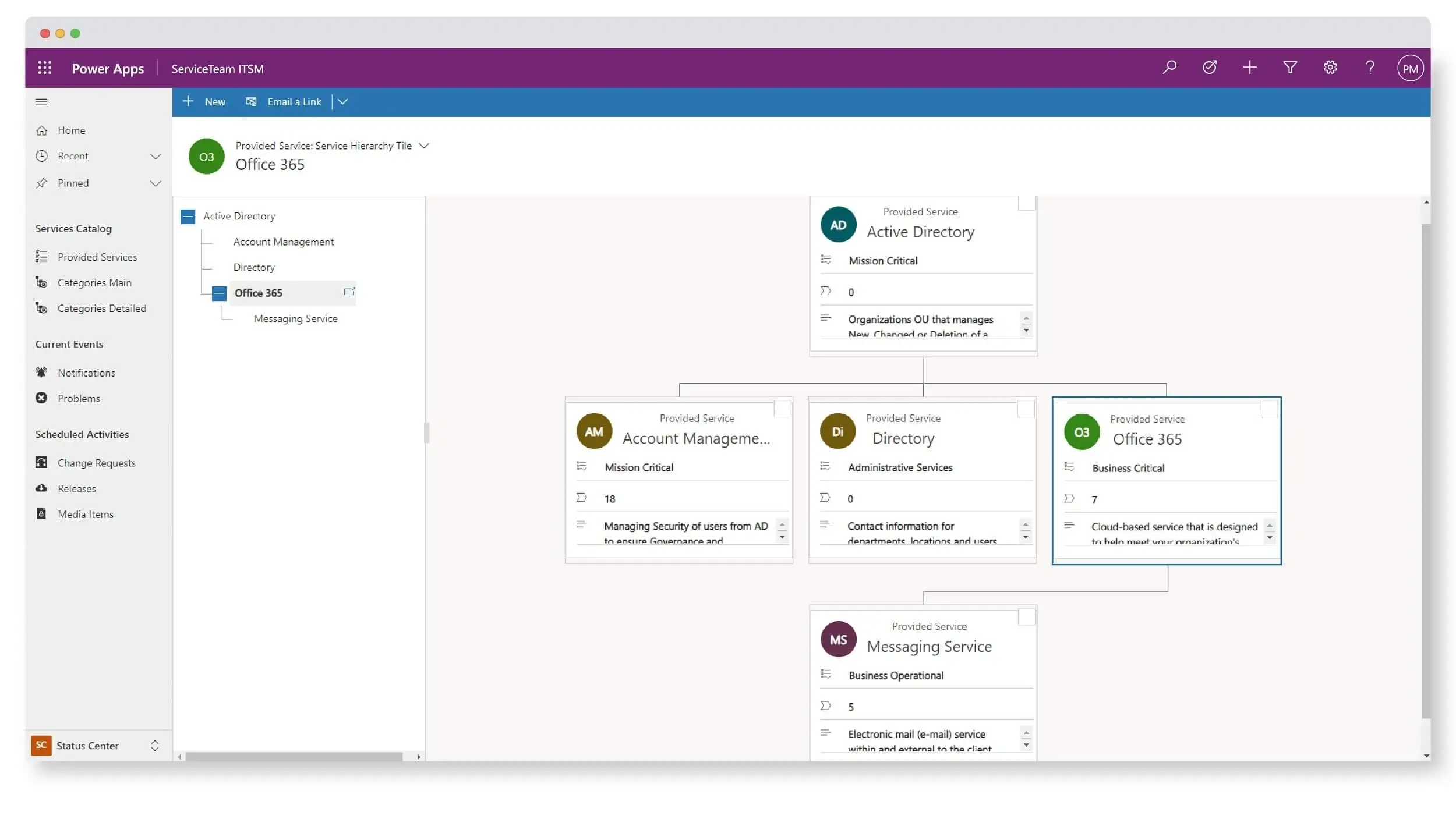
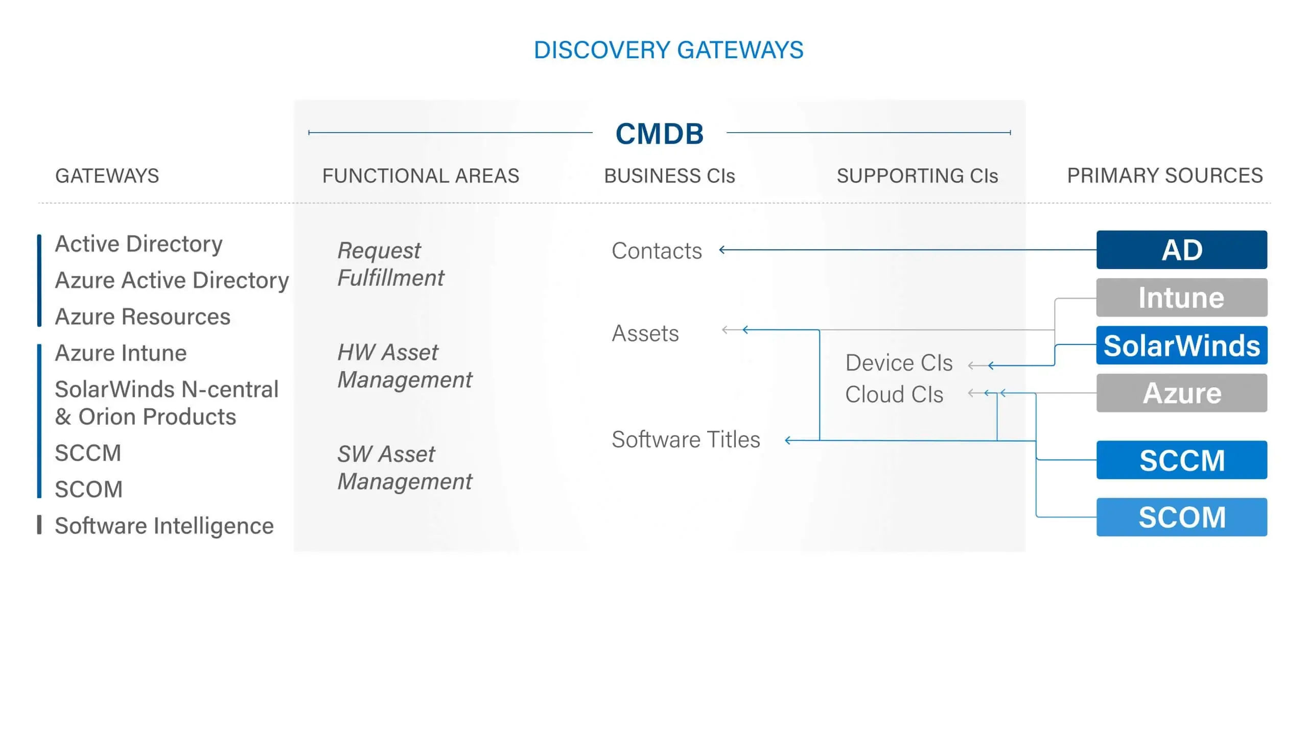
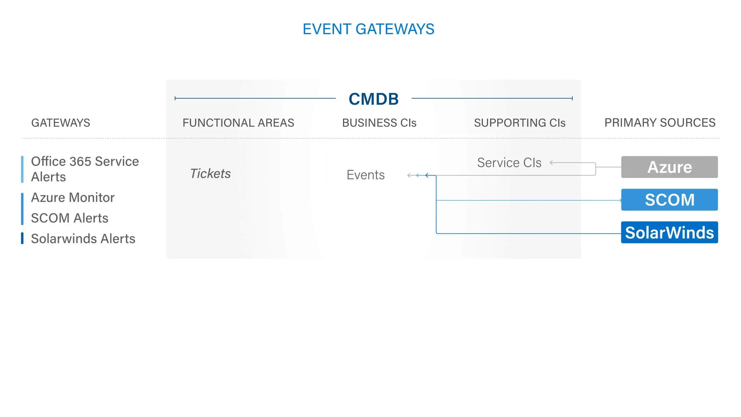
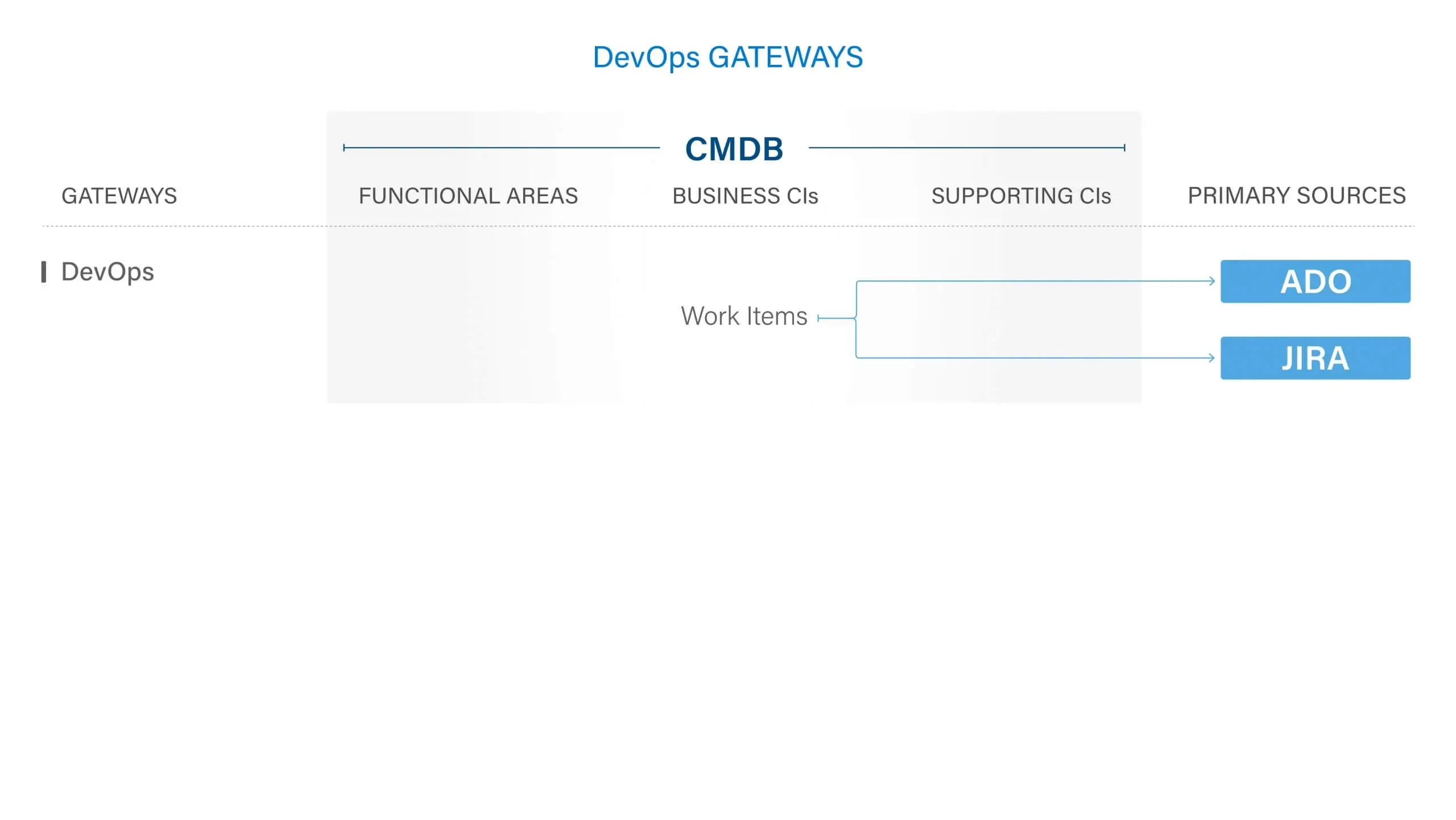
ServiceTeam ITSM work items let the Service Desk team seamlessly collaborate with other departments, such as HR and Finance, by utilizing cross-departmental workflows enabled by assigned work items—with their own tasks—solving cross-departmental scenarios that require coordination with multiple teams. The ServiceTeam ITSM Timeline Insights capability automates the collection of three types of information, predefined measures, field tracking and status tracking, which helps you understand advanced ticket analytics and audit history, such as ticket and traffic reporting. ServiceTeam ITSM lets you associate tickets to business, technical and managed services. You can also take advantage of the ability to uniquely leverage the ServiceTeam ITSM ticket template capability per customer, including differentiating templates, segmentation and routing depending on your unique customer needs.
See ServiceTeam ITSM Tickets capability in action. Only two minutes long.