


Ready to Get Started
At Provance, we go out of our way to bring you great service. That’s in our digital DNA. Your IT success is our success.
In the first blog post in the Great IT Service Management series, What You Need to Know—What You Need to Do, Howard M. Cohen, 35-year veteran of the IT industry, wrote about what a great Service Manager can do to achieve great customer service. In the second blog post, The Most Important Tools, Howard M. Cohen concluded that data was the most important tool great Service Managers need to have in their pocket to achieve great customer service.
So, in this blog post, I’m going to take the theoretical into the practical and show you how our customers as well as those here at Provance have leveraged out-of-the-box Power Platform and Power BI dashboards and reports to get great data into the hands of service desk agents and managers.
First though, let me tell you a little bit about me. In my current position with Provance, I help customers implement and get value from our ITSM solutions. My job is to help our customers make better decisions by leveraging the features and benefits of our products, including all the out-of-the-box Power Platform dashboards and Power BI reports. Before joining Provance, I worked for an MSP that provided services and support primarily to large government agencies. As a result, I have a detailed understanding of the day-to-day challenges faced by Microsoft MSPs and Partners (our customers).
In the first part of this blog post, I’m going to walk you through some of the out-of-the-box dashboards and reports and how our customers use them. In the second part, I’m going to introduce you to a series of customized reports that we created at Provance to help us manage our professional services implementation projects from a PMO perspective and to position us to be able to provide direct input into the invoicing and billing process.
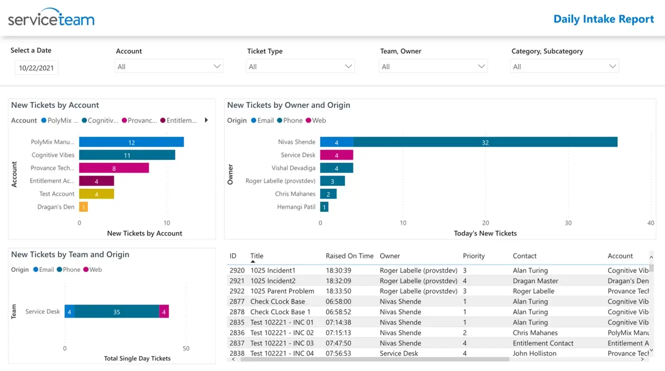
The purpose of this report is to give a Service Desk Manager a snapshot of new tickets that the service desk has received that day. Service Managers are able to see incoming tickets by account, contact, new tickets by owner and origin, and new tickets by team and origin. Arguably an essential report.
When I review this dashboard, I’m really looking to see if there’s something unusual going on. For example, is there a certain service or product that I’m offering that’s creating a lot of tickets? Or is there one customer that has an unusual number of tickets coming through? From this report a Service Manager can understand exactly what’s happening, and then drill down to see more information.
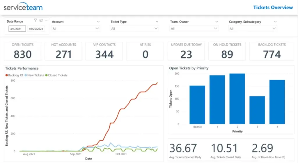
The purpose of the Tickets Overview Report is to provide actionable data to help Service Managers ensure that SLAs are not breached. The report shows the number of daily new tickets, opened, closed and backlogged (tickets that remain unresolved by the End-Of-Day).
Here, I can see what’s happening with respect to tickets via priority, status, category, and account. For example, I can look at how many backlogged tickets there are for a specific account, which will help me understand if there might be a customer satisfaction issue happening or about to happen and therefore, I can be more proactive. I can reach out to my team to understand what’s happening. I can assign more resources to resolve these outstanding tickets. I can also see trends over a specific time, for more in-depth analysis.
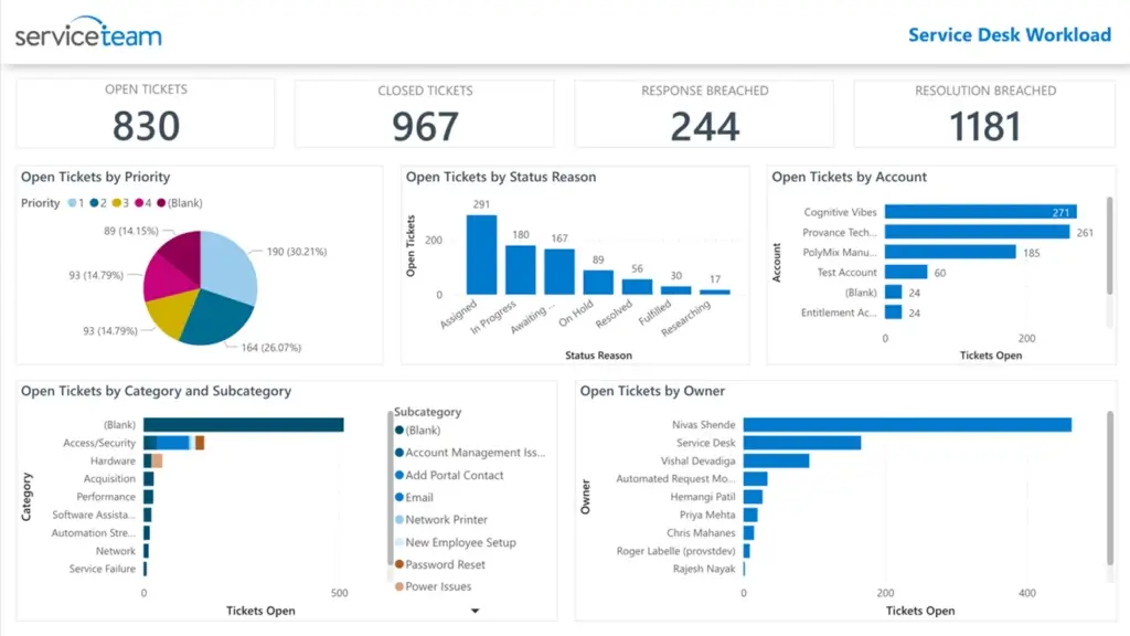
The purpose of the Service Desk Workload report is to understand the overall workload of team members. Service Managers can monitor all open tickets by priority, status reason, account, category and subcategory. You can also see the total number of active tickets, closed tickets, responses breached, and resolutions breached.
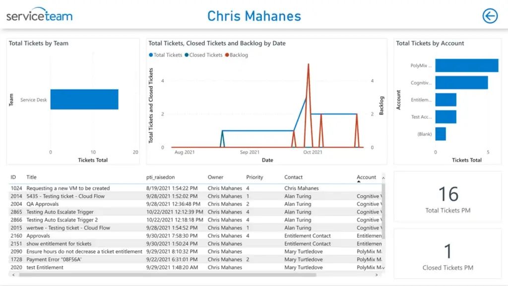
Here, for example, I can see that too large a portion of tickets haven’t been allocated to a team member for resolution. And I also see that Chris appears to be overwhelmed with work in comparison to the rest of the team. With a click I can drilldown into a specific agent’s workload report and understand, for example, what tickets and accounts Chris is working on and see how many tickets he has open, closed or backlogged. From here it’s quite easy to allocate or to reallocate tickets to better utilize the internal resources and skillsets.
I’ve just given you a sampling of a few of the out-of-the-box dashboards and reports that we have available in ServiceTeam ITSM. For more information on dashboards and reports, contact us or check out these blog posts:
How ServiceTeam ITSM Leverages User-Centered Methods to Enhance the Agent Experience
How ServiceTeam ITSM Helps Managers Leverage Power BI Reports for ServiceDesk Optimization
We engineered our out-of-the-box dashboards and reports to make sure we put the most important information at the hands of the stakeholders who are using these reports. We also use visual cues to denote things like a hot account or VIP status, which helps call attention to information we think will be important to you.
Of course, since ServiceTeam ITSM is built on the Power Platform, the leading no-code, low-code platform, it’s very easy to customize or create your own dashboards, charts, views, and reports to meet your very specific business needs. This is what Provance has done in support of our own professional services business.
Part 2: Provance Professional Services Customized Report—Project Portfolio
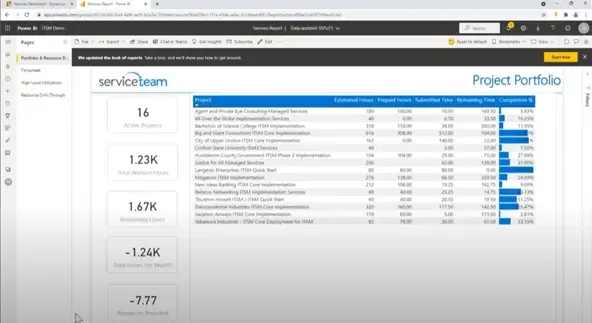
The purpose of this report we created is to give us a business perspective of our service engagements. This report helps us manage whether we’re meeting project and financial expectations when we help our customers implement our products into their environment. We customized this report using the Power BI integration to ServiceTeam ITSM.
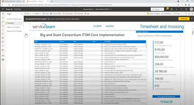
In this Project Profile report, we can see the total number projects, the total number of hours worked, how many hours remain, how many hours worked this month, and resources required. We can see on a project level, where we are within the project, giving us a basic understanding of the health of the implementation. I can also take this to a deeper level and look at it from a time sheet perspective. Equally important, it supports our monthly billing review and invoice processes.
I can also look even further and analyze over time what’s been happening and how we’ve been utilizing staff.
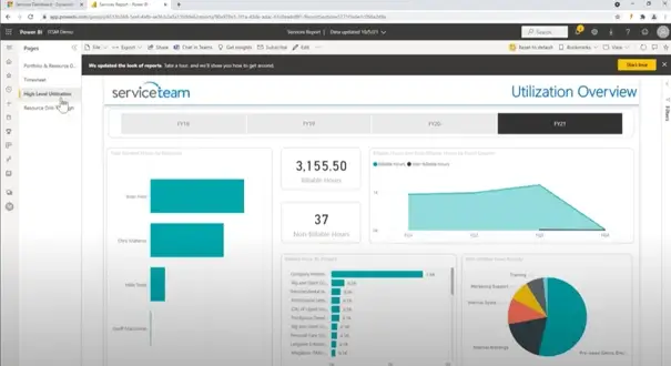
For example, I can see that as overworked as Chris is, from a billing perspective, he’s doing great. All of his time is billable, with almost no non-billable hours.
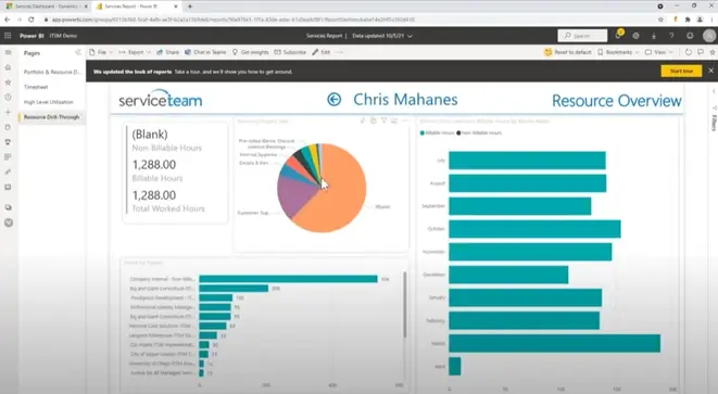
By drilling down even further, I can see Chris’ specific activity and get a clearer picture of what he’s been doing this month and why he’s so overworked. I can see the services he’s been working on, the ratio of billable to non-billable hours by month, which gives me a much better understanding on whether I’m effectively leveraging Chris to deliver services to customers. And equally as important, if I need to consider giving Chris a well-deserved break.
We engineered ServiceTeam ITSM to provide you with out-of-the-box Power BI dashboards and reports to visually communicate and deliver intelligent ITSM insights and answers to common questions from managers and key stakeholders. I’ve given you a snapshot of these dashboards and reports that are available, for more information on what’s available contact us and/or request a demo.
Here’s some other resources we think you might find interesting:
Webcast: How ServiceTeam ITSM Leverages User-Centered Methods to Enhance the Agent Experience
Blog Post: Microsoft Copilot: The AI and Automation Opportunity for ITSM
Blog Post: Why and How Your ITSM Capabilities Need to Change
Blog Post: Why Our Customers Choose ServiceTeam Over All the Others
Webcast: City of London Transforms IT Services with ServiceTeam ITSM and the Microsoft Power Platform

At Provance, we go out of our way to bring you great service. That’s in our digital DNA. Your IT success is our success.